Redrawing the World: Why the New Map Matters
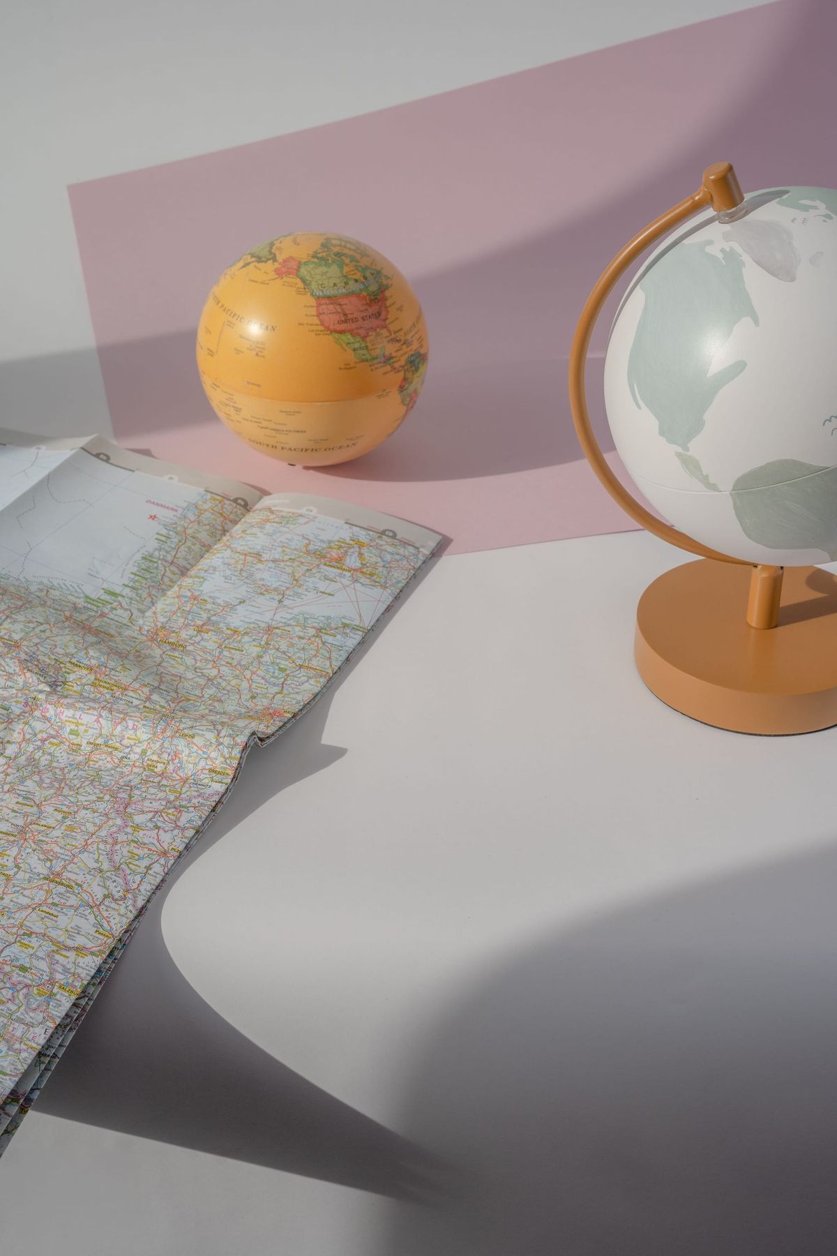
The UN has voted to replace the Mercator projection with the Equal Earth projection. So what does this mean? And why does it matter?
The Mercator map has been in use for centuries [1]. Created in 1569 by Flemish cartographer Gerardus Mercator, the map was designed to help European sailors and privateers navigate the oceans at a time when many European nations, such as Spain, England and Portugal, were setting sail for the so-called 'New World' of the American continent. It served its purpose extremely well - sailors were able to cross the seas accurately. However, to allow for simpler navigation and accommodate the curvature of the Earth, the Mercator projection distorts the size of countries - those nearer to the equator appear smaller, while those nearer to the poles appear larger.
But centuries later, we no longer use the map primarily for navigation, so why is it still so dominant? Despite no longer being used exclusively for navigational purposes, the map is still found in nearly every geography classroom and is the basis for many digital mapping platforms, such as Google Maps. This creates geographical misconceptions and leads to the physical minimisation of the Global South (nations that are generally regarded as having lower levels of economic and industrial development and are typically, though not exclusively, located in the Southern Hemisphere). The most common example is Africa and Greenland: although Africa is roughly fourteen times larger than Greenland, this size difference is minimised on the Mercator map, making the two landmasses appear more comparable in size [2]. In this case, size does matter, as this distortion risks underplaying the role of nations in the Global South on the international stage in favour of those in the Northern Hemisphere. This map, created by a European at a time when the European continent was expanding its knowledge of the wider world, favours Eurocentrism. In an increasingly interconnected world, it is vital that geographical landmasses are represented in a way that reflects their true size, so that governments and organisations in the Global South can be heard proportionately. Living in Europe, it is natural that we focus on our neighbouring nations. Yet, for a map so widely used, those in Africa and Central America also need to be properly represented in classrooms, online and in major international organisations.
The new map that the UN has chosen is called the Equal Earth projection. Developed in 2018, the map aims to represent landmasses more accurately. The 'Correct the Map' campaign was started by Africa No Filter and Speak Up Africa. The map was adopted by the African Union in February 2026, before the United Nations vote [1]. 164 countries backed the initiative [3]. This success led to the UN resolution discouraged the use of the Mercator projection for most uses other than navigation. The Equal Earth projection was created in response to the decision of Boston Public Schools to use the Gall-Peters projection, which distorted the size of regions near to the poles. Although the newly adopted map will appear unfamiliar for the majority of people, it has been used for thematic maps, for instance NASA's 2018 map of global mean temperature anomaly [4].
However, all maps have flaws because it is impossible to represent area, distance and direction accurately all at once on a two-dimensional map. Unlike the Mercator projection, the Equal Earth projection cannot be used to measure distances between landmasses accurately. But we do not need a one size fits all map; they can all be used as and when most appropriate.
As the Mercator map is no longer used primarily for its original purpose, I am convinced that the 'Correct the Map' resolution by the United Nations General Assembly is a positive step towards adjusting our perspective on the Global South.
By Natasha Callis
[1] https://www.bbc.co.uk/news/articles/cly5r60v4mro
[2] https://newworldmap.org/new-world-map